A good friend and SWE asked me to redesign his personal website to better reflect his technical skillset and move beyond its previous simplicity. I used the project to explore modern design systems, accessibility, and intentional interactions, while developing a more expressive visual language through creative interactive pages & UI elements. I took it as an opportunity to push my own visual practice, researching my questions all while exploring how design and development can work together through the 4 main pillars of grids, colors, components, and typography, guided by my mentor Tanvi Pisal, a UX Designer at Apple.
Site is fully designed and currently in integration.
my role
Lead UI Designer, Lead UX Designer
LOCATION
New York, New York
tools
Adobe Illustrator, Figma
sPECIAL THANKS
Tanvi Pisal (Apple), Aedin Pereira (Pinterest)
02
Design system study
Aedin's Website
AP Website
April 2026 - july 2026
Next project
© 2026 Lisa Lei. All rights reserved.
This project was a special one. Sania Bhatia (Tisch ’26) and I were paired to create a music video for an artist from Clive Davis, NYU’s music school, incorporating generative AI into our creative process.
Created as our final project for First-Time Generative Filmmaking in the Age of Hypercinema, taught by NYC artist Gabriel Barcia Colombo, the project brought together everything we had been experimenting with throughout the semester, everything from generative AI models and prompt-based workflows to traditional filmmaking and immersive design tools.
View the project below as well as our testimonies to the process and our thoughts on generative AI as artists.
A good friend and SWE asked me to redesign his personal website to better reflect his technical skillset and move beyond its previous simplicity. I used the project to explore modern design systems, accessibility, and intentional interactions, while developing a more expressive visual language through creative interactive pages & UI elements. I took it as an opportunity to push my own visual practice, researching my questions all while exploring how design and development can work together through the 4 main pillars of grids, colors, components, and typography, guided by my mentor Tanvi Pisal, a UX Designer at Apple.
Site is fully designed and currently in integration.
A good friend and SWE asked me to redesign his personal website to better reflect his technical skillset and move beyond its previous simplicity. I used the project to explore modern design systems, accessibility, and intentional interactions, while developing a more expressive visual language through creative interactive pages & UI elements. I took it as an opportunity to push my own visual practice, researching my questions all while exploring how design and development can work together through the 4 main pillars of grids, colors, components, and typography, guided by my mentor Tanvi Pisal, a UX Designer at Apple.
Site is fully designed and currently in integration.
my role
VFX Generator, Assistant filmmaker
Lead UI Designer, Lead UX Designer
LOCATION
New York, New York
tools
DaVinci Resolve, Generative AI tools used: MidJourney, Flora Fauna, Runway 2.0, Google Gemini, ChatGPT
Adobe Illustrator, Figma
sPECIAL THANKS
Sania Bhatia (NYU Tisch), Gabe Barcia-Colombo (Instructor ITP)
Tanvi Pisal (Apple), Aedin Pereira (Pinterest)
Next project
I’m a designer who loves to talk through ideas and visuals. I believe the best way to understand my process is through conversation, so let me walk you through the full process and prototype.
LOOKING FOR THE COMPLETE PICTURE?
Aedin's previous website
LOOKING FOR THE COMPLETE PICTURE?
I’m a designer who loves to talk through ideas and visuals. I believe the best way to understand my process is through conversation, so let me walk you through the full process and prototype.
LOOKING FOR THE COMPLETE PICTURE?
I’m a designer who loves to talk through ideas and visuals. I believe the best way to understand my process is through conversation, so let me walk you through the full process and prototype.
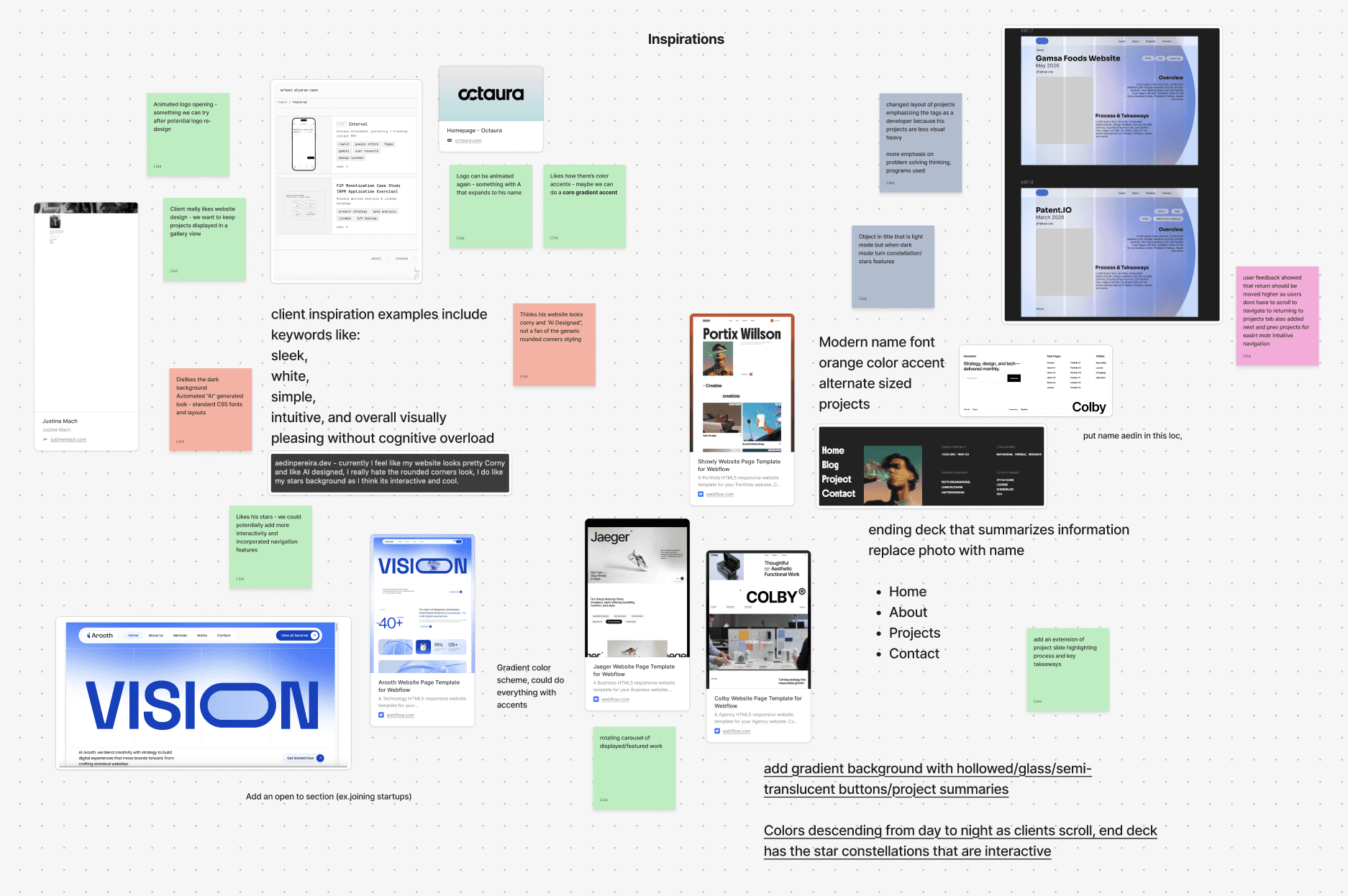
In tandem with my client's website audit and re-design, my curiosuity sparked for properly learning design systems - I wanted to re-train everything I knew about them.

Next project
Aedin's previous website
In tandem with my client's website audit and re-design, my curiosuity sparked for properly learning design systems - I wanted to re-train everything I knew about them.
In tandem with my client's website audit and re-design, my curiosuity sparked for properly learning design systems - I wanted to re-train everything I knew about them.
So naturally, I did what any curious designer would do. I hopped on a call with an experienced mentor, opened up Google and Figma, and got to work.




So naturally, I did what any curious designer would do. I hopped on a call with an experienced mentor, opened up Google and Figma, and got to work.
So naturally, I did what any curious designer would do. I hopped on a call with an experienced mentor, opened up Google and Figma, and got to work.


following: COMPONENTS
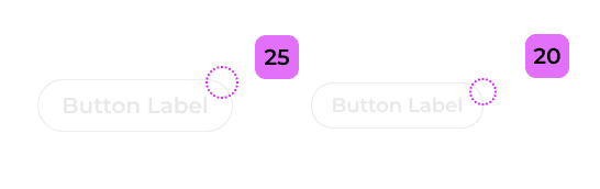
After defining the color foundation, I audited the components needed for the portfolio: primary CTA buttons, ghost buttons, text links, project cards, and navigation items. Each component's states (default, hover, active, disabled, focus) were then mapped back to specific tokens from the color ramps.

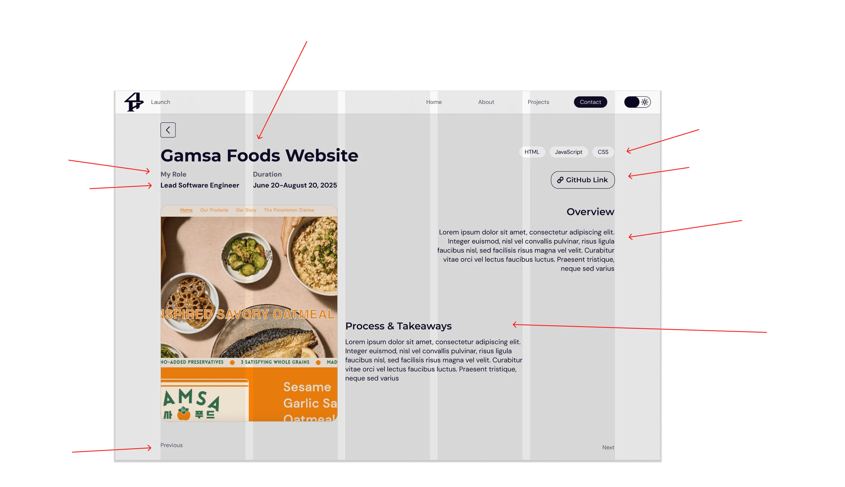
This analysis helped me decide grid system to use for Aedin's site.
I analyzed three websites across the design–engineering spectrum to compare how layout grids, margins, gutters, and directional flow communicate intent, wether for a personal designer/developer portfolio to a commercial site.
first off: grids
This is only a snapshot of the design system. Contact me and let me walk you through the full process and prototypes in
***
How do I determine which elements to stack or scale across different interfaces?
Question that came up:
I learned that stacking elements are used when a narrower screen would make side-by-side layouts difficult to read or use like text, navigation, forms, and buttons.
Scaling elements is used when preserving visual proportions and composition, like for images, videos, charts, graphics, etc.


next: colors
I explored color combinations against WCAG contrast standards, then expanded the initial palette into flexible ramps for light and dark interfaces.
I expanded on the pure neutral ramp (true grays from #FFFFFF to #000000) my client wanted. This extension helped me in deciding to not directly use pure tones but close to as its easier on the eyes and pure black creates harsh contrast, especially from halation.
I learned that yes, if secondary text conveys information, it is still subject to WCAG contrast requirements. Normal-sized text requires a minimum 4.5:1 contrast ratio, while large text requires 3:1.
Does secondary text need to meet WCAG contrast requirements?
Question that came up:

Expansion of colors & neutrals with ramps
Old color palette

I can attest as a sufferer of astigmatism.
Dark Mode
Light Mode
FINALLY: TYPOGRAPHY

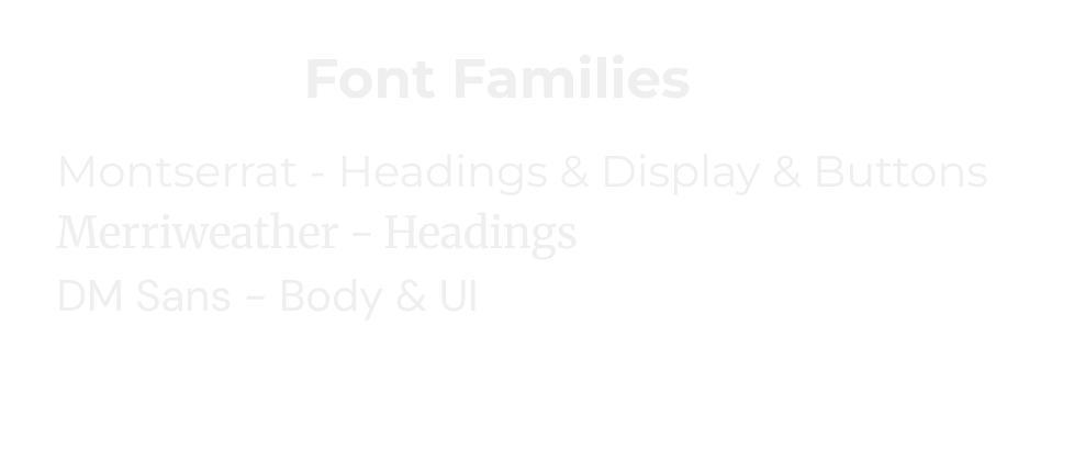
I created a whole typographic system for Aedin's ite that combined serif and non-serif fonts as well as color accents.
I learned that mobile typography prioritizes legibility and hierarchy within a limited screen size, often reducing display and heading sizes while keeping body text relatively consistent. The body size being almost consistent with larger screen sizes was something I rarely took note of before this study, but now it's something I'm super conscious of when designing.
How do mobile and other interface's font sizes compare with desktops?
Question that came up:


This analysis helped me decide grid system to use for Aedin's site.
I analyzed three websites across the design–engineering spectrum to compare how layout grids, margins, gutters, and directional flow communicate intent, wether for a personal designer/developer portfolio to a commercial site.
first off: grids
***
This is only a snapshot of the design system. Contact me and let me walk you through the full process and prototypes in
How do I determine which elements to stack or scale across different interfaces?
Question that came up:
I learned that stacking elements are used when a narrower screen would make side-by-side layouts difficult to read or use like text, navigation, forms, and buttons.
Scaling elements is used when preserving visual proportions and composition, like for images, videos, charts, graphics, etc.
next: colors
I explored color combinations against WCAG contrast standards, then expanded the initial palette into flexible ramps for light and dark interfaces.
I expanded on the pure neutral ramp (true grays from #FFFFFF to #000000) my client wanted. This extension helped me in deciding to not directly use pure tones but close to as its easier on the eyes and pure black creates harsh contrast, especially from halation.
I learned that yes, if secondary text conveys information, it is still subject to WCAG contrast requirements. Normal-sized text requires a minimum 4.5:1 contrast ratio, while large text requires 3:1.
Does secondary text need to meet WCAG contrast requirements?
Question that came up:
I can attest as a sufferer of astigmatism.
Old color palette
Expansion of colors & neutrals with ramps
Light Mode
following: COMPONENTS
After defining the color foundation, I audited the components needed for the portfolio: primary CTA buttons, ghost buttons, text links, project cards, and navigation items. Each component's states (default, hover, active, disabled, focus) were then mapped back to specific tokens from the color ramps.
FINALLY: TYPOGRAPHY
I created a whole typographic system for Aedin's ite that combined serif and non-serif fonts as well as color accents.
I learned that mobile typography prioritizes legibility and hierarchy within a limited screen size, often reducing display and heading sizes while keeping body text relatively consistent. The body size being almost consistent with larger screen sizes was something I rarely took note of before this study, but now it's something I'm super conscious of when designing.
How do mobile and other interface's font sizes compare with desktops?
Question that came up:
I analyzed three websites across the design–engineering spectrum to compare how layout grids, margins, gutters, and directional flow communicate intent, wether for a personal designer/developer portfolio to a commercial site. This also helped me recognize what elements should be stacked in mobile (or more confined) layouts.
This analysis helped me decide grid system to use for Aedin's site.
first off: GRIDS
This is only a snapshot of the design system. Contact me and let me walk you through the full process and prototypes in
***
Question that came up:
How do I determine which elements to stack or scale across different interfaces?
I learned that stacking elements are used when a narrower screen would make side-by-side layouts difficult to read or use like text, navigation, forms, and buttons.
Scaling elements is used when preserving visual proportions and composition, like for images, videos, charts, graphics, etc.
I explored color combinations against WCAG contrast standards, then expanded the initial palette into flexible ramps for light and dark interfaces.
I expanded on the pure neutral ramp (true grays from #FFFFFF to #000000) my client wanted. This extension helped me in deciding to not directly use pure tones but close to as its easier on the eyes and pure black creates harsh contrast, especially from halation.
next: colors
Question that came up:
Does secondary text need to meet WCAG contrast requirements?
I learned that yes, if secondary text conveys information, it is still subject to WCAG contrast requirements. Normal-sized text requires a minimum 4.5:1 contrast ratio, while large text requires 3:1.
Old color palette
Expansion of colors & neutrals with ramps
I can attest as a sufferer of astigmatism.
Dark Mode
Light Mode
After defining the color foundation, I audited the components needed for the portfolio: primary CTA buttons, ghost buttons, text links, project cards, and navigation items. Each component's states (default, hover, active, disabled, focus) were then mapped back to specific tokens from the color ramps.
following: COMPONENTS
I created a whole typographic system for Aedin's ite that combined serif and non-serif fonts as well as color accents.
finally: typography
Question that came up:
I learned that mobile typography prioritizes legibility and hierarchy within a limited screen size, often reducing display and heading sizes while keeping body text relatively consistent. The body size being almost consistent with larger screen sizes was something I rarely took note of before this study, but now it's something I'm super conscious of when designing.
How do mobile and other interface's font sizes compare with desktops?
© 2026 Lisa Lei. All rights reserved.
© 2026 Lisa Lei. All rights reserved.
conclusion
I had a blast creating elements for his site in addition to configuring new UX flows and creative interactions for such a talented developer. This project made me realise how many design principles I was uncertain of and had the opportunity to learn throughout this process.
Aedin’s website is currently in integration with advanced interactions. Here's a sneak peek.
I can’t wait to show you the product we crafted together.
conclusion
Aedin’s website is currently in integration with advanced interactions. Here's a sneak peek.
I can’t wait to show you the product we crafted together.
I had a blast creating elements for his site in addition to configuring new UX flows and creative interactions for such a talented developer. This project made me realise how many design principles I was uncertain of and had the opportunity to learn throughout this process.
conclusion
I had a blast creating elements for his site in addition to configuring new UX flows and creative interactions for such a talented developer. This project made me realise how many design principles I was uncertain of and had the opportunity to learn throughout this process.
Aedin’s website is currently in integration with advanced interactions. Here's a sneak peek.
I can’t wait to show you the product we crafted together.
Dark Mode
